Design & Themes
Customize the look and feel of your storefront to match your brand identity.
Theme Appearance
Configure your store's visual elements and design settings from Design > Appearance.
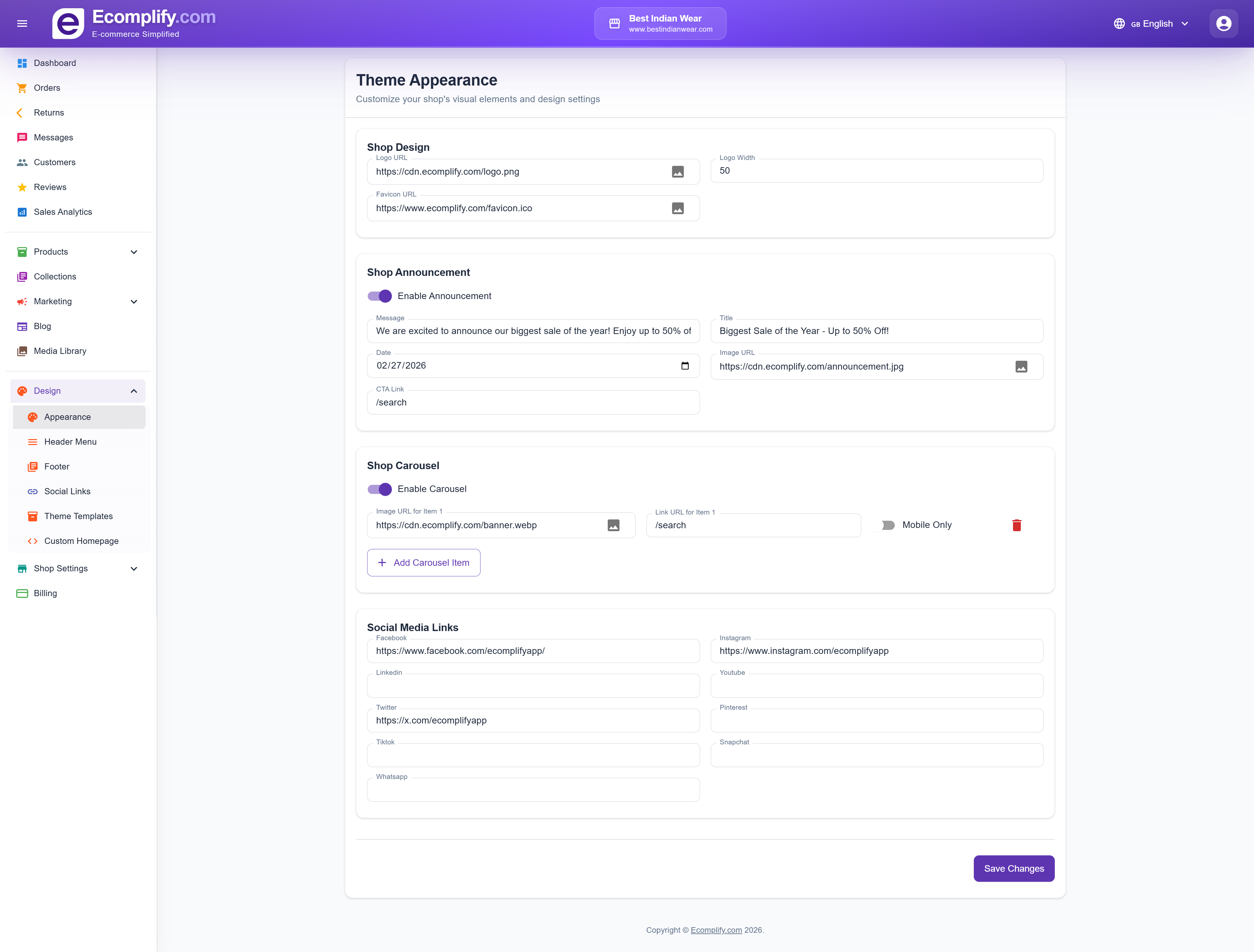
Shop Design
- Logo URL - Set your store logo image
- Logo Width - Adjust logo display size
- Favicon URL - Set the browser tab icon
Shop Announcement
Enable an announcement banner at the top of your storefront:
- Message - The announcement text
- Title - Banner heading
- Date - When the announcement expires
- Image URL - Banner background image
- CTA Link - Link for the call-to-action button
Shop Carousel
Configure the homepage hero carousel:
- Enable/disable the carousel
- Add multiple carousel items with images and links
- Set items as mobile-only or desktop-only
- Add and remove carousel slides
Social Media Links
Connect your social media accounts:
- Facebook, Instagram, LinkedIn, YouTube
- Twitter/X, Pinterest, TikTok, Snapchat, WhatsApp
Header Menu
Customize the navigation menu from Design > Header Menu.
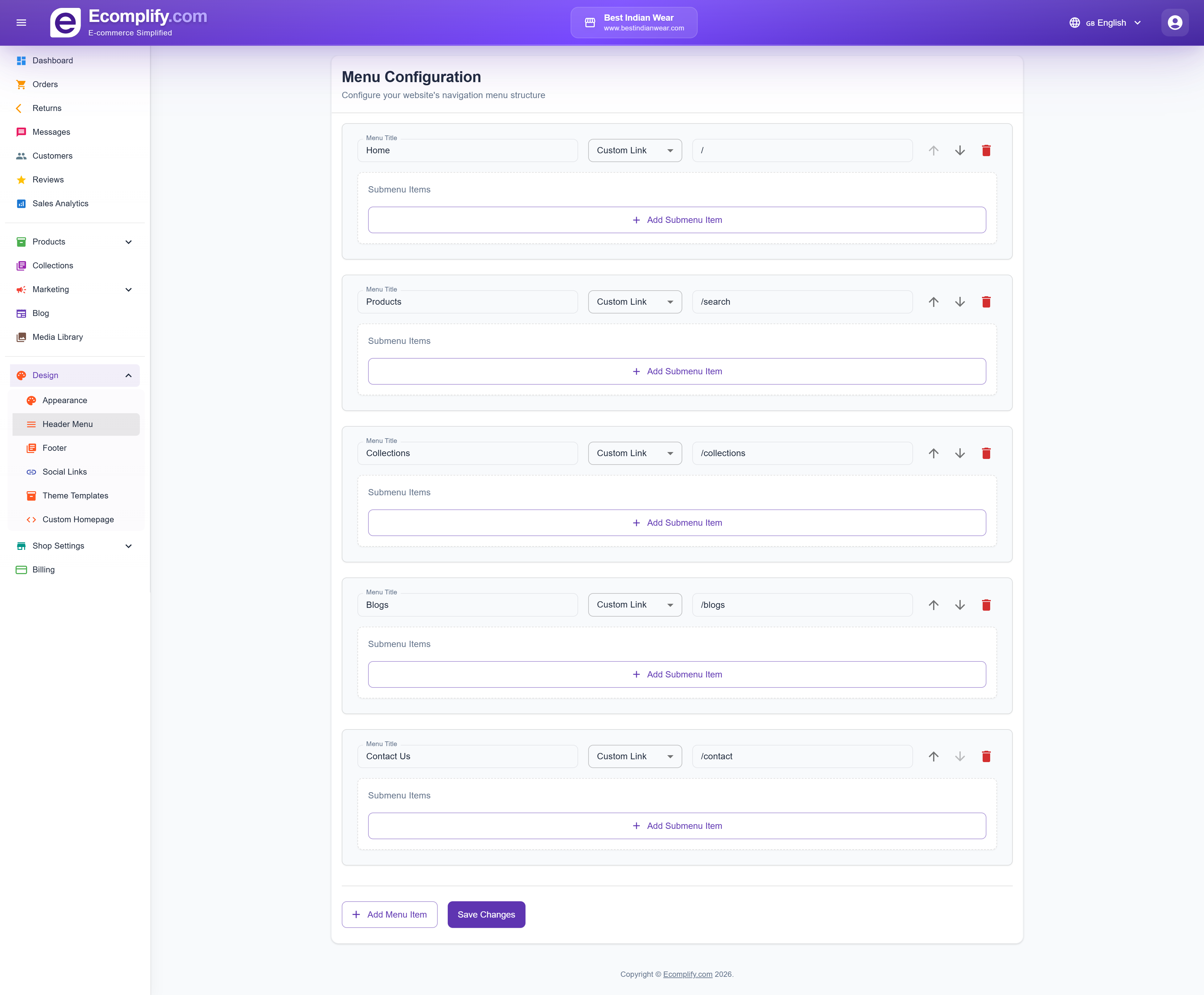
Configure navigation items that appear in the storefront header, including:
- Menu item labels
- Link URLs
- Dropdown sub-menus
- Menu item ordering
Footer
Manage footer content from Design > Footer.
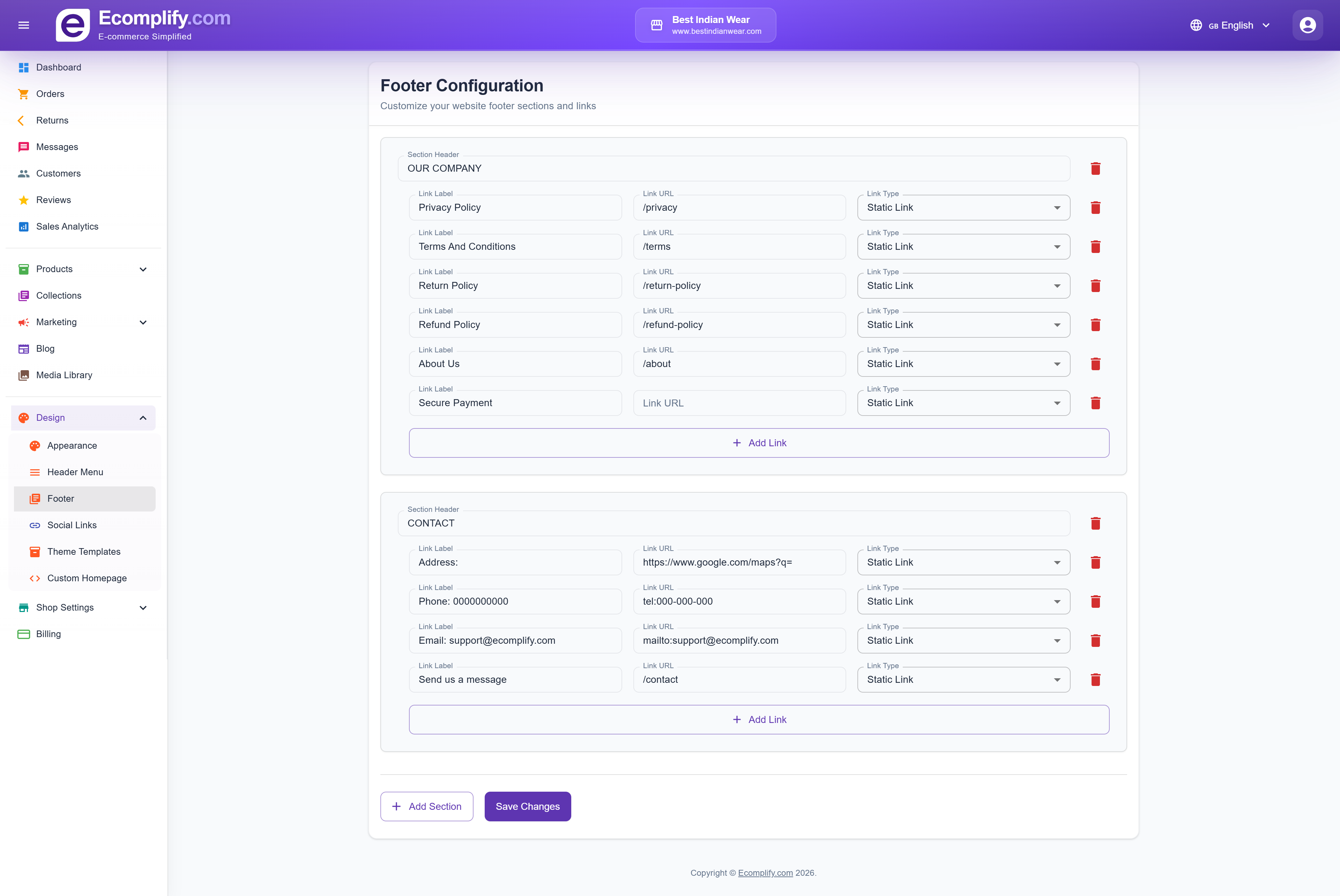
Customize your footer sections:
- Company information links
- Support links
- Contact information
- Custom link groups
Social Links
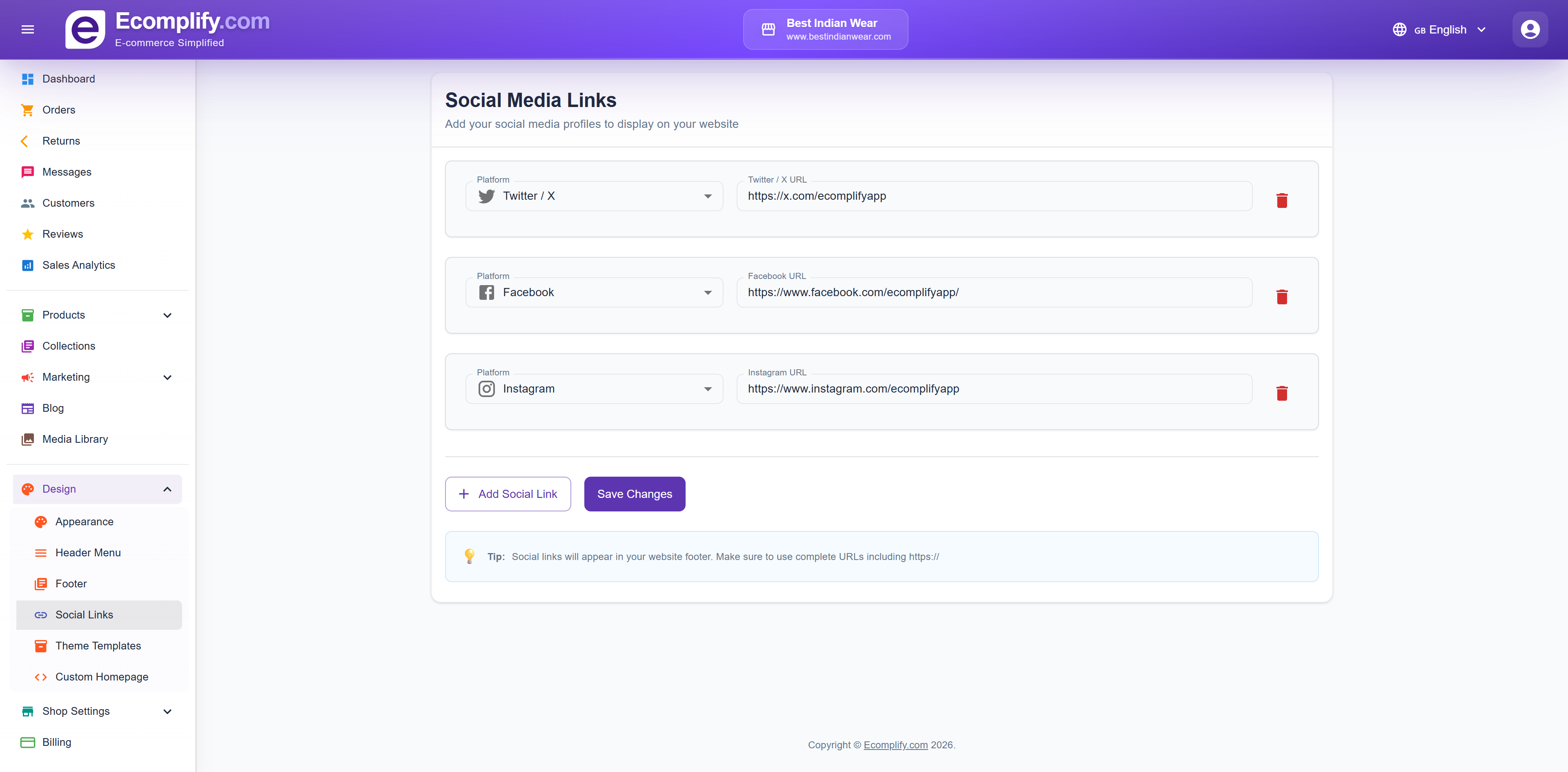
Manage social media links that appear in the storefront from Design > Social Links.
Theme Editor
Design → Theme Editor is the visual page builder: add and rearrange sections on any page of your store, preview on desktop and mobile, then publish.
It's the most powerful tool in this section and has its own guide: Theme Editor.
Global Styles (design tokens)
Global styles are your store-wide look — set once, applied to every page and every theme, whether you use a ready-made theme or a custom design built in the Theme Editor.
Edit them in either of two places (they are the same settings):
- Design > Brand Styles
- The Theme tab inside the Theme Editor, so you can adjust them while designing pages
Anything you leave blank keeps the theme's default, and individual sections in the Theme Editor can still override any of these values for just that section.
What you can style
- Page — background colour, text colour, body font (any Google Font), link colour and sale badge colour
- Brand accent — your main accent colour and the text colour used on top of it, applied to highlights and interactive elements across the store
- Headings — heading font, colour and weight, independent of the body text
- Type scale — H1 to H4 sizes plus body and caption sizes, with separate mobile sizes. Fluid heading sizes scales headings smoothly between the mobile and desktop values instead of jumping at one screen width. Letter spacing and line height are adjustable for both headings and body text
- Buttons — four button styles used across the store:
- Primary — background, text, hover colours, corner shape (rounded, square or pill), weight, and optional uppercase labels
- Secondary — background, text, border and hover colours
- Outline — text-and-border buttons that fill in on hover
- Link — text-only call-to-action links, with an underline toggle
- Form inputs — background, text, border and focus colours plus corner radius, applied to search boxes, checkout fields, newsletter forms and every other input
- Cards & surfaces — card background and corner radius, muted text colour, border colour, and the placeholder colour shown behind images while they load
- Header, footer & announcement — background and text colours for the header, footer and announcement bar, footer link colour, and the option to hide the shop name when your logo already contains it
- Global custom CSS — your own CSS rules injected on every page, for anything the controls above don't cover
Change a button colour or a heading font here and it updates everywhere at once — product pages, checkout, custom pages, everything. Only reach for per-section settings in the Theme Editor when one section should deliberately look different.
Theme Templates
Choose from multiple theme designs from Design > Theme Templates.
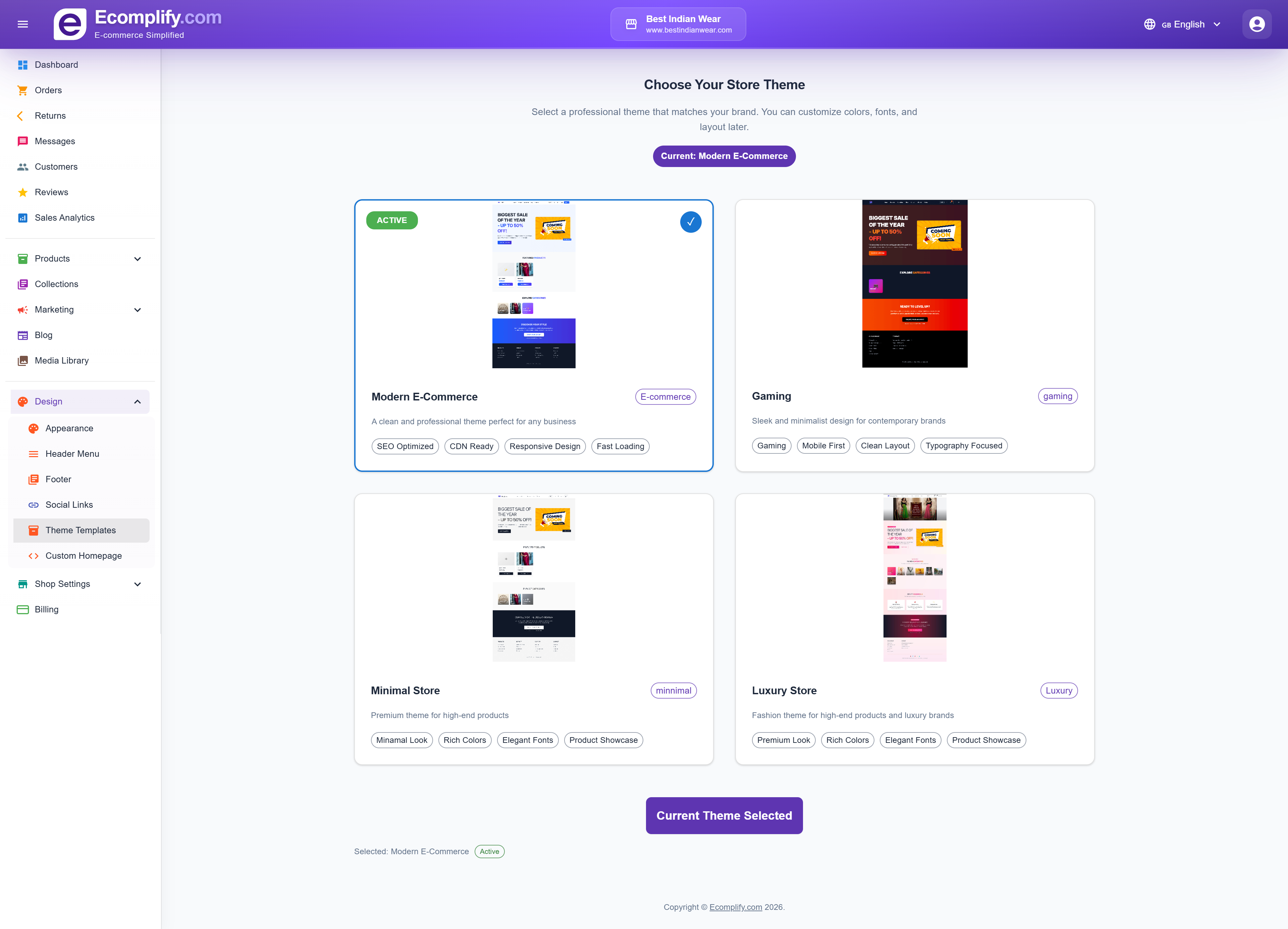
Browse and apply different theme templates to change your storefront's overall look. Each theme provides a unique layout and visual style.
Custom Homepage
For advanced customization, use the Custom Homepage Editor at Design > Custom Homepage.
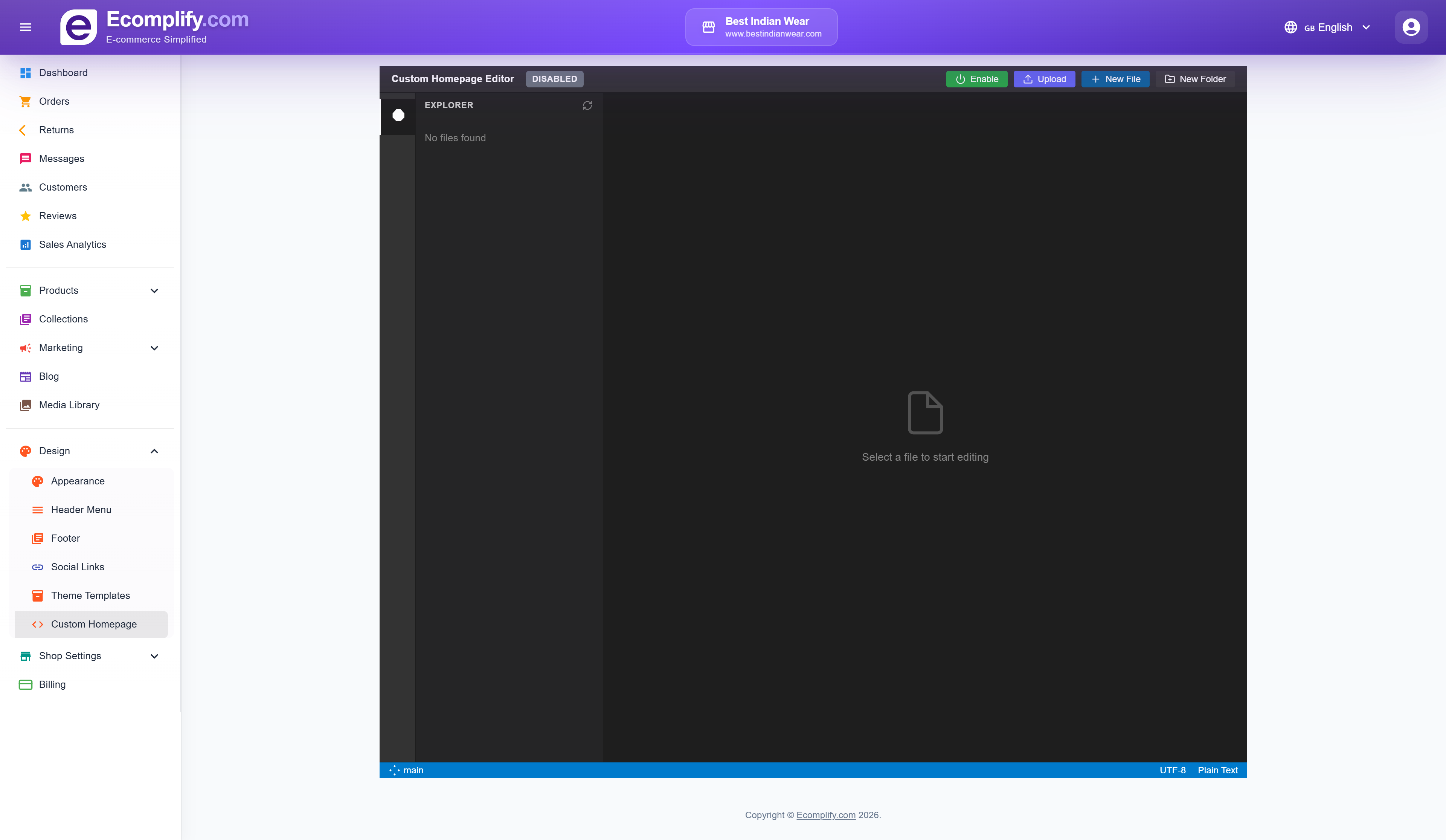
The custom homepage editor provides:
- Full file explorer for your custom code
- HTML, CSS, and JavaScript editing
- Upload custom files
- Create new files and folders
- Enable/disable custom homepage
- Code editor with syntax highlighting
This allows you to build a completely custom homepage using your own HTML, CSS, and JavaScript, giving you full control over the storefront design.
Storefront Design
The color and style controls that used to live under Design > Appearance > Storefront Design — header and footer colors, the primary/accent color, button style, announcement bar colors and custom CSS — have moved to Design > Brand Styles, alongside many new options. See Global Styles (design tokens) above.
When writing custom CSS, use the browser's developer tools (right-click > Inspect) to identify CSS class names and element selectors for targeting specific components.